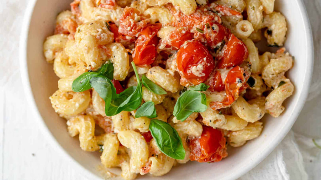
A University Student’s Guide to Tik Tok’s Famous Baked Feta Pasta

Photo from https://www.delish.com/uk/cooking/recipes/a35426947/baked-feta-pasta-tiktok/

Currently, I am a 3rd year student at UVic studying sociology. Though I enjoy analyzing society, I love to cook. However, I didn’t always like to cook, as I started university eating instant meals and not knowing where to begin. Thus, Brianna and I created a video and infographic to hopefully inspire and help other university students get in the kitchen and begin their food journey.

Here is our lesson plan:

https://docs.google.com/document/d/125A5ivJxwAh39bXvwCAU6TwEh1jtYcRAXJvelXMUlUM/edit?fbclid=IwAR2ye-kxiuk-nAIQ6wGhrlesRZN0dR_hcoAkaW2aRapEMRQEA1NcAaqGAcU#heading=h.mr58s0136981

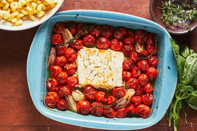
Here is our interactive video:

Photo from https://www.realsimple.com/food-recipes/cooking-tips-techniques/baked-feta-pasta-tiktok

To see a written version, here is an infographic that lays out all the ingredients and the instructions for this recipe:
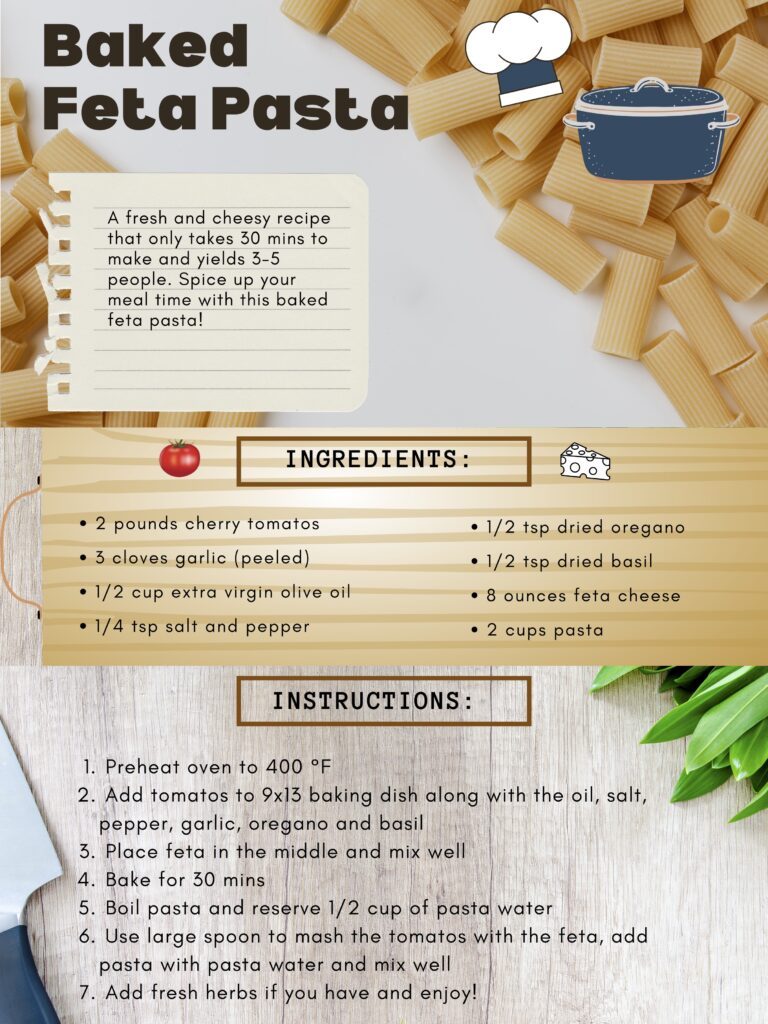
The Multimedia Learning Principles and Learning Theories that directly relate to our video and infographic include: 

The Coherence Principle: 

  • We used simple text and simple visuals in our infographic to avoid increasing cognitive load.
  • We also only included necessary clips in our video so it isn’t too overwhelming to watch. 

The Redundancy Principle: 

  • Our video showcased narration and graphics instead of narration, graphics and text.
  • We wanted our video to focus on animated visuals and our infographic to focus on written words and pictures.

The Modality Principle: 

  • By using a voice-over to narrate our video, it is easier to follow along with because you don’t have to keep going back and forth between the visuals and the text. This principle will help the learner retain information more efficiently. 
  • Spoken words are  definitely more meaningful than on-screen text. 

Dual Coding Theory:

  • Animated visuals are included in our video so the audience can see and follow along.
  • When each step of the recipe is demonstrated, spoken words are used to enhance learning. 

The Spatial Contiguity Principle:

  • In our infographic, we made sure to place relevant text and images close together so it is easy to determine which image corresponds to each piece of text. 

The Signaling Principle: 

  • To show the learner exactly what to pay attention to on the screen, we bolded and put borders around important words in our infographic. 
  • We also used bullet points to list the ingredients and numbered each step so it is organized and not overwhelming. 
  • In our blog post, we added hyperlinks to multimedia sources and alternate cooking sources so learners can reference whenever they want and learn more. 

The Temporal Contiguity Principle:

  • In our video, corresponding audio and visuals are presented at the same time so the audience can see what the narrator is referencing. 

The Segmenting Principle:

  • Our video has the option to pause, skip, rewind, etc so the audience can control the pace of their learning and it isn’t one continuous video. 
  • We split our infographic into small segments: the intro, ingredients, then the instructions. 

Cognitive Load Theory:

  • In our video, each clip contains only one idea.
  • The narrator also paused shortly after every idea to indicate they were moving onto the next step. 

The Multimedia Principle: 

  • Our infographic contains words and pictures instead of words alone so the reader is able to match each step to a picture and visualize the cooking process even more. 

The Self-explanation Principle: 

  • We wanted to enhance the learner’s attention and learning comprehension by adding multiple choice and true or false questions to our video using H5P. 
  • We also included some tips as textboxes and an encouraging note at the end of the video to hopefully leave the audience feeling accomplished and like they learned something.

The Personalization Principle: 

  • The narrator didn’t talk too fast or too slow and used a casual and informal voice to make learning less boring. 
  • We also wanted to personalize our video by including background music. 

The Voice Principle: 

  • We used a human voice instead of a computer voice to narrate our video so it is easier to hear, comprehend, and retain what is being said. 

The Image Principle: 

  • Instead of making a talking head video, we made a POV video that helped reinforce the audio voice-over. 
  • This technique works well for demonstrations and helps the audience follow along and understand what is happening in the video. 
Photo by Conscious Design on Unsplash

Cooking doesn’t have to be threatening, hard or expensive. Remember, cooking is all about being creative and no matter who you are, you can cook! I hope you can take something positive away from our video and infographic and we can’t wait for you to try out this recipe! 

If you are interested in looking at more easy and fun recipes, check out these links! 

  1. https://www.youtube.com/watch?v=9_5wHw6l11o
  2. https://www.budgetbytes.com/top-10-recipes-for-college-students/
  3. https://www.youtube.com/watch?v=L0d3MfTTnTY

Sketchnote *TRANFORMED* = Sketchnote/H5P Hybrid!

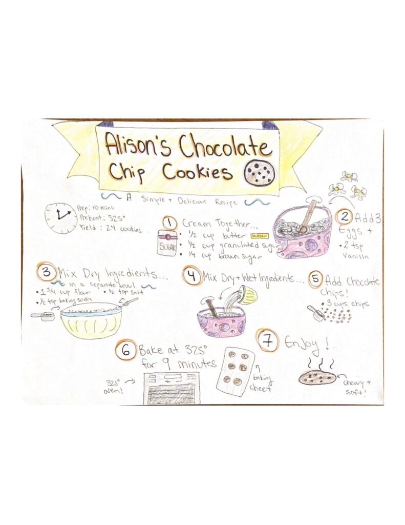
I decided to revamp my sketchnote of my chocolate chip cookie recipe and make it more interactive and effective in knowledge transfer.

With that being said, I created a sketchnote/H5P video hybrid that clearly voices each step of the baking process. The inspiration to transform my sketchnote into an H5P video came from my love of ebooks. I find that when information is “read aloud” it helps me comprehend and retain information better than by just reading it myself. It also helps me make sure I am not missing or skipping important information.

Looking back at Mayer’s 12 principles of multimedia, the voiceover on my revamped sketchnote follows the modality principle. This principle favors audio and pictures over text and pictures. Therefore, I wanted to incorporate spoken words to my sketchnote because hearing and seeing is more effective than just seeing information. It also helps with memorization so if you want to make this recipe again, hopefully you would have retained the steps.

I also added the self-explanation principle to my new sketchnote to enhance the learner’s attention and learning comprehension by adding multiple choice and true or false questions. This way, I am able to make sure the learner is following along and processing what is being taught. I also included a text box at the end of my video to hopefully leave the audience feeling accomplished and like they learned something.

Additionally, by using three different prompts, I have demonstrated the segmenting principle because the information is broken up into smaller units. This also gives the learner various learning opportunities and different ways of looking at the information.

Lastly, I included the personalization principle by talking in a casual and informal voice. I also made sure not to talk too fast, too slow and not sound like I was going on and on. This hopefully will make learning less boring.

My new and improved sketchnote/H5P hybrid showcases a better range of multimedia learning principles that will hopefully call attention to the main points of my sketchnote and help learners feel motivated to bake some cookies!

Tony’s Blog: Billy Graham’s Ted Talk

This is such a good analysis of Billy Graham’s Ted Talk! I really enjoyed how thorough you were when talking about the issues with overloading working memory and how important it is to include cognitive theories to make an effective PowerPoint presentation. It is interesting how Billy was able to change his voice to keep the audience’s attention and indicate that he was moving onto a new topic. 

I also like how you embedded a video in your blog post because following the modality principle, spoken words can increase the ability to process and retain information more effectively than written words. It also brings more of a personal aspect to your post. 

You have definitely mastered multimedia learning and it is clear to me that you know how to use dual coding theory and cognitive load theory to make an exceptional blog post. I wonder if splitting the information up into smaller sections and incorporating the coherency principle in your post would be beneficial to help guide the reader’s attention even more. 

Overall, I really enjoyed reading through your blog post and appreciate the time and effort you spent making it. Fantastic work!

Click here to see Tony’s Blog

Photo by Product School on Unsplash

Feng’s Blog: Twine Story

I really enjoyed your Twine story on the domination of an evil dragon. It is well thought out and follows the segmenting principle very nicely because users can spend as much time as they need on each page and can explore at their own pace. Your story would also be very helpful for people who are new users of Twine. It is a great example for how to use Twine and to demonstrate how storytelling can be an effective method of learning. 

I also like how you incorporated the coherency principle in your blog post by focusing on one topic per paragraph. This way, the reader can focus on specific information which increases the ability to process and retain information. 

It is clear to me that you know how to use Mayer’s multimedia principles to make an effective Twine story and an organized blog post. I wonder if incorporating signaling principles such as bolding or underlining important words or information would be helpful so readers can direct their attention even more. 

All and all, I enjoyed reading through your blog post and your Twine story. Great Job!

Click here to see Feng’s Blog

Photo by Laith Abushaar on Unsplash

Brianna’s Blog: Discovering Twine

I really enjoyed your Twine story! It is very creative and well balanced with pictures and information. Twine is such a good method to use for tutoring because people are more interested in learning if they are almost tricked into thinking of it like a story. It is like an educational disguise! In your blog post, you demonstrated the signaling principle very nicely by using bullet points and underlining specific words. I appreciate this because it helps me follow along easily.

Additionally, I really enjoyed how you included hyperlinks to sources on your blog post so it is convenient for the reader to notice while reading and reference if they want to learn more.

The look of your blog post is very organized and aesthetically pleasing. It is clear to me you have a thorough understanding of Dr. Ray Pastore’s multimedia principles and how to use these principles to make an effective Twine story. I wonder if adding another image would help to increase the visual impact of your blog post even more.

Overall, you have made a very inspiring blog post and this post would be helpful for other tutors and teachers to see. Well done!

Click here to see Brianna’s Blog

Photo by Ben on Unsplash

The Power Of Drawing and Sketchnoting

Drawing is like reading comprehension. For example, if you are drawing out a recipe, you are almost tested on whether you fully understand what you are trying to make. This process could also be helpful with school work because drawing allows you to actively expand on words and practice a new form of processing and retaining information. It could also increase your creativity and interest in the material!

The multimedia learning principles and learning theories that relate to my sketchnote on baking chocolate chip cookies include: 

  • Dual Coding Theory: there is a mix of visual words and images so it can capture the reader’s attention and they can follow along better. 
  • The Spatial Contiguity Principle: people learn best when images and text are close together and not on separate pages. In my sketchnote, I made sure to place important information close together and within each step. 
  •  The Coherence Principle: irrelevant information can decrease learning and overwork your brain. I tried to only include simple images and text to make this recipe easy to follow and read.  
  • The Signaling Principle: inserting cues to important information can help you focus on relevant elements. I circled each step to capture the reader’s attention and included pictures that demonstrated what each step was.
Photo by Joshua Bedford on Unsplash

How To Make A Persuasive Presentation

In this week’s blog, I will be examining a TED Talk video through the lens of multimedia learning principles and learning theories. An effective and educational presentation consists of techniques that aim to engage and grab the attention of your audience, rather than bore and overload their brains.

In this TED Talk on How animals and plants are evolving in cities by Menno Schilthuizen, the techniques that made this presentation successful include:

1. Multimedia Learning Principles

  • The Personalization Principle: the speaker talked in a casual and informal voice, like he was having a friendly conversation with the audience. It didn’t sound like the speaker was going on and on which made learning more engaging and manageable.
  • The Modality Principle: the speaker included slides with just 1 image to portray the topic and some slides also included short text. The rest of the information was being narrated.
  • The Coherence Principle: only included simple text and images on each slide that directly related to the main topic being presented. Slides weren’t too detailed or crammed with too many images.

2. Dual Coding Theory

  • Visual words and images are included so the audience can see and follow along
  • When the slide is a picture, spoken words are used to enhance learning
  • When words are presented, the speaker is not directly reading them off the slides

3. Cognitive Theory

  • Each slide only contains 1 idea
  • There is a mix of images, text and spoken words
  • The speaker paused shortly after every idea

Photo by freestocks on Unsplash

Storytelling with Twine

Twine is a fun and interactive website that allows users to use storytelling as a means of teaching and learning. People are more intent and interested in learning if they are almost tricked into thinking of it like a story. Additionally, students become more personal, passionate and intrigued about material when they can relate to it.

By looking over all the principles from Mayer’s 12 Principles of Multimedia, the principles that directly relate to my interactive Twine story are:

  • The Coherence Principle: this principle conveys how irrelevant information can decrease learning and overwork your brain. In my Twine narration, I only included simple text and visuals that directly relate to the main topic being presented on each page.
  • The Spatial Contiguity Principle: people learn best when images and text are close together and not on separate pages. In my Twine story, I made sure to be mindful of the placement of my material and kept it close together.
  • The Segmenting Principle: people learn better when information is spaced out in learner-paced segments rather than as a continuous unit. Twine allows users to skip forward, go back, pause and play each page of my story at their own pace so information can be recalled and retained more effectively.

Click here to view my Twine story!

Photo by Ben White on Unsplash

Photo by Jaredd Craig on Unsplash


H5P Interactive Video Revamp

I decided to revamp my H5P interactive video on Powtoon and make it more interactive and effective in knowledge transfer. I also reflected on the comments I got on my blog feedback and incorporated an image in my blog that related to my topic. 

Looking back at Dr. Ray Pastore’s video on multimedia learning principles, I added the segmenting principle to my new H5P video to enhance the learner’s attention and learning comprehension. The segmenting principle states that people learn better when information is presented in learner-paced segments rather than as a continuous unit. I also included the signaling principle which is the idea that people learn better when cues are added that highlight important information. 

In my original H5P video, I only included one multiple choice question and one text box. I want to add to this to better conform to multimedia learning principles and engage the audience even more. Therefore, I decided to add one more multiple choice question, two true and false questions, and one encouraging text box at the end of my video. By using three different prompts, I have demonstrated the segmenting principle because the information is broken up into smaller units. This also gives the learner various learning opportunities and different ways of looking at and retaining the information. My multiple choice questions also incorporate the self-explanation principle because I am able to make sure the learner is following along and processing what is being taught. Additionally, my updated video demonstrates the signalling principle because the text boxes act as cues over the video and signals the attention of the learner without disrupting the flow. I also included a text box at the end of my video to hopefully leave the learner feeling accomplished and like they learned something.

My new and improved H5P video showcases a better range of multimedia learning principles and learning theories that will hopefully help learners follow along more efficiently and call attention to the main lessons of my video. 

Photo by https://www.powtoon.com

Tony’s Blog: Learning Theories

I really enjoyed that you added the concept of flow theory and highlighted how important it is in multimedia learning and an effective PowerPoint presentation. I also like how you incorporated the modality principle when talking about verbal contribution in a PowerPoint presentation. Spoken words are definitely more meaningful than text! 

Lastly, I like that you included a reference source to learning theories so the reader is able to explore this information further. I wonder if adding signaling principles such highlighting or bolding important information would be beneficial and help direct the reader’s attention even more. 

All in all, you demonstrate a strong understanding of learning theories and how to make a captivating blog post.

Click here to see Tony’s Blog

Photo by Product School on Unsplash

« Older posts

© 2024 Alison 101

Theme by Anders NorenUp ↑